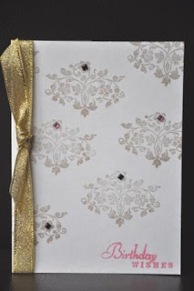
Now that I have my copper inkpad ready, here is my another take on "Less Is More" challenge. Again, it's probably the choice of the layout, I find the card would be too dark if I didn't add some color, so the "birthday wishes" sentiment is in pink.
Perhaps someone can help me out here. I always find the outcome of the stamped image is not even. I'm stamping it on an even surface, of course. But somehow it doesn't come out the way I want. Any advice?
Thanks for visiting.
Perhaps someone can help me out here. I always find the outcome of the stamped image is not even. I'm stamping it on an even surface, of course. But somehow it doesn't come out the way I want. Any advice?
Thanks for visiting.
