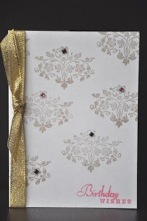
Now that I have my copper inkpad ready, here is my another take on "Less Is More" challenge. Again, it's probably the choice of the layout, I find the card would be too dark if I didn't add some color, so the "birthday wishes" sentiment is in pink.
Perhaps someone can help me out here. I always find the outcome of the stamped image is not even. I'm stamping it on an even surface, of course. But somehow it doesn't come out the way I want. Any advice?
Thanks for visiting.
Perhaps someone can help me out here. I always find the outcome of the stamped image is not even. I'm stamping it on an even surface, of course. But somehow it doesn't come out the way I want. Any advice?
Thanks for visiting.
3 comments:
This is a lovely stamp, I like the addition of the bling too!
Thanks again.
Chrissie
"Less is More"
Sweet card Diana, like this one
stampiong is all about light eevn inking [tapping down onto the stamp] Then pressing firmly holding still with one hand.
Is this a clear stamp? They are definitely more tempermental. The ink type differs greatly. Ther are a new range out called Clearly Perfect you get a much better effect.
Lookign at yours Id say it was down to pressure when you actually palce it on the card
Thansk for submitting another entry
Mandi LIM
Hi Diana, Stamping can be so frustrating especially when you go straight onto the card base. I always test stamp to make sure the stamp is inked well and especially if it's a new stamp. I also use a piece of funky foam under my project to act as a stamping mat especially when using clear stamps as they do require a bit of cushioning sometimes the other thing that springs to mind is the inkpad... obviously some are better than others but storing inkpads upside down is a great idea so they are nice and juicy when you come to use them.
Hope this helps:)
I like the stamped design and the bling is a great touch:)
Jenny x
Post a Comment